


You’ve no doubt experienced it before. You land on a website and within seconds you feel it: credibility, polish, authority, luxury. Nothing obvious jumps out. It’s not any one thing—sure the brand is professional, the typography is clean, and the photography is slick—but it’s the overall impression.
That sense of quality, trust, and authority isn’t accidental. It’s an emotional impression carefully crafted—what we’d call “a premium experience”. It’s rooted in applied psychology, and understanding these principles can elevate your website from basic, common, cheap, “run-of-the-mill”, to premium and memorable.
It’s important to note that a sense of “luxury” isn’t necessarily the goal. Often a sense of grandeur and lavishness doesn’t fit the brand. “Premium” doesn’t equal “luxury”…a premium website still serves a more practical, utilitarian brand best because it communicates that the brand is anchored on servicing customers and treating them like royalty (“we spent money on this website because our customers deserve the best experience possible). A premium website commands trust, and because it’s inherently easier to navigate and pleasurable to use than a cheap, crappy website, it commands trust, and communicates respect for the visitor.
At An Infinite Number of Monkeys, we approach every client website project as if it deserves a premium website—whether it’s for a local hair salon, a city-wide plumbing firm or a luxury jewelry business.
Below are three core psychological principles that separate forgettable websites from brands that earn instant credibility.
First Impressions: Engineering the Halo Effect
Research shows users form an opinion about a website in a fraction of a second—literally milliseconds. That first impression shapes how everything else is perceived.
This is driven by a cognitive bias known as the halo effect. When the initial experience feels professional and intentional, visitors subconsciously assume the company, services, products, and customer support are equally of high quality. If the first impression feels cluttered, dated or poorly designed, skepticism sets in (even if the messaging on the site is strong).
Conversely, a cluttered, poorly designed header can create a negative halo, causing skepticism—even if the rest of your site is fantastic.
What this means in practice
The most valuable real estate on a website is the top portion of your homepage—what users see before they scroll, aka the “above-the-fold”-” content.

A premium website will treat this space as strategically valuable territory:
- A clear, confident headline
- Purposeful layout
- High-quality imagery or visuals
- Strong visual contrast and breathing room
- Clear and concise messaging: what you do, why it matters, how customers can get it.
Nothing is accidental. Every element contributes to a single emotional outcome: confidence.
When we design hero sections for clients, we often start with the question: “What should someone feel immediately — trust, innovation, calm, ambition? Then we build around that.
Reduce Cognitive Load: Make It Effortless
The human brain is wired to conserve energy. When something feels confusing, cluttered, or mentally demanding, friction increases and trust decreases. This mental strain is called cognitive load.
A website that overwhelms visitors with competing elements, unclear navigation, or inconsistent design feels chaotic.
Even with a modern, minimalist design, we often face the challenge of clients wanting to put so much information on a page, feeling it’s all needed upfront for their customers to make a decision to buy. Too much content overwhelms with excessive cognitive load, and the core message gets lost—or overlooked as website visitors avert their eyes from the chaos. We remind them that often “less is more”.
We recommend using a layering technique, keeping the initial presentation of a concept sparse and focused on a single value message. Allow users to explore deeper levels (linking to sub-pages) if they want to explore further, or perhaps deliberately keep some messaging off the website, providing a compelling reason for interested prospects to reach out for more detail.
Premium websites create the opposite effect: cognitive fluency. They are easy to process. And when something is easy to process, we instinctively perceive it as more credible and higher quality.
How premium sites reduce friction
- Generous white space
- Clear visual hierarchy
- One primary goal per section
- Predictable, simple navigation
- Logical information flow
- Focus on the core benefits
This isn’t about minimalism for its own sake. It’s about mental clarity. When users feel calm and in control, they associate that feeling with your brand. If a visitor has to “figure out” your website, you’ve already lost ground.
Micro-Interactions: Small Details, Big Impact
This is where craftsmanship shows.
Micro-interactions are the subtle responses that happen when users engage with a site:
- A button that smoothly reacts on hover
- A form field that confirms success
- A refined transition between sections
- Scroll animations that feel intentional and help tell a story (rather than just being eye-candy)
These moments seem minor, but they create emotional peaks. This ties into a psychological principle called the peak-end rule: people remember their experience based on the most intense moments and the way it concludes. Thoughtful micro interactions add those “peaks” of positive emotion, creating moments of delight that make your site memorable.
Thoughtful micro-interactions create small, positive spikes throughout the experience. Over time, those moments add up to a perception of quality.
Cheap websites feel static. Premium websites feel alive. The difference is care and attention to detail.
Like everything, one must exercise restraint and not go overboard. Every micro-interection must serve a usability goal. Subtlety is the name of the game here. With great power comes great responsibility.
How Leading Brands Apply These Principles
Global brands don’t just “have good design.” They understand psychological principles.
Apple: Mastering First Impressions
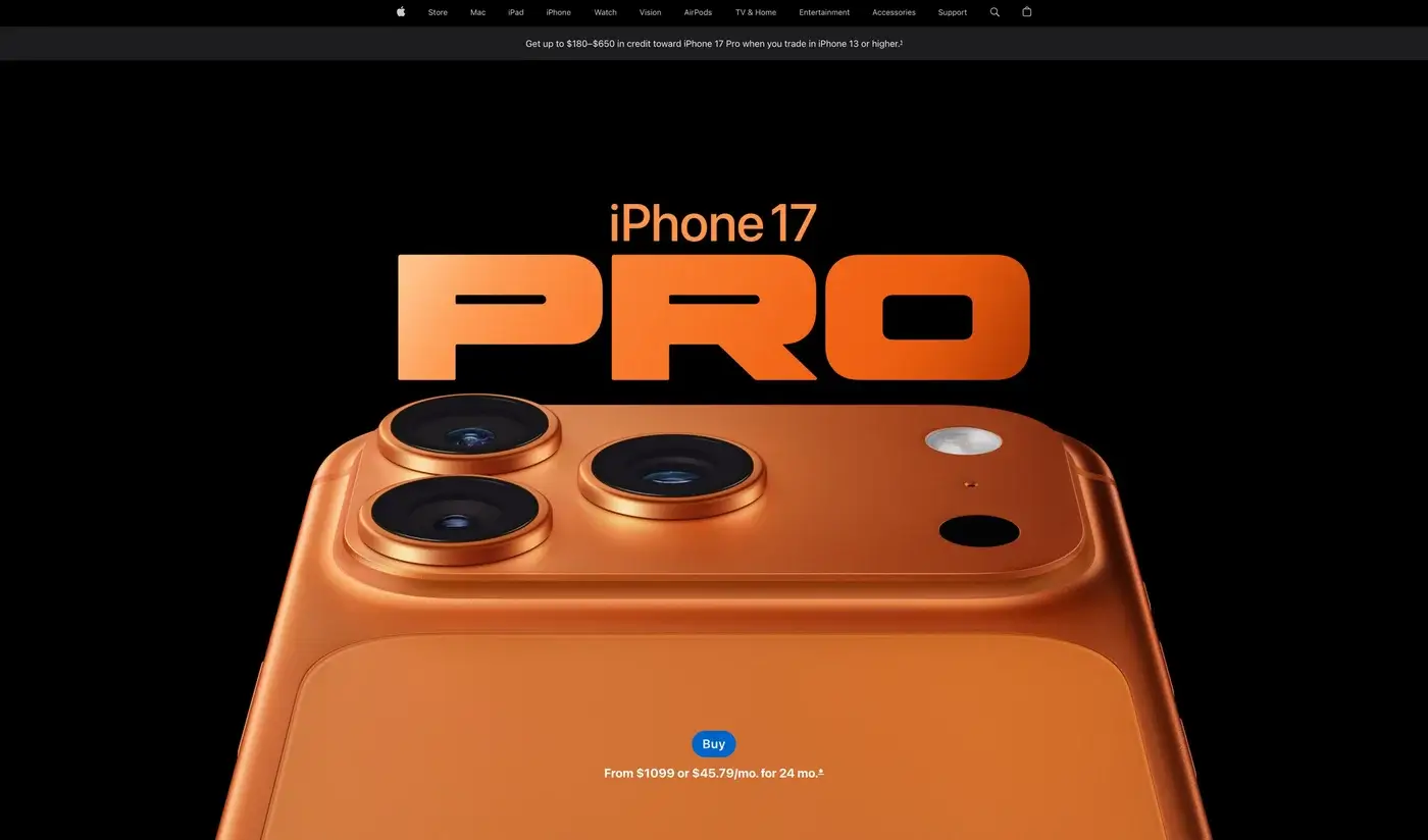
Apple leads with simplicity and confidence. Large product imagery, minimal copy, and clear hierarchy create an immediate halo of innovation and quality. Navigation is intuitive. Interactions are fluid. The site’s layout is effortless, and micro interactions, like scrolling and menu animations, are satisfyingly smooth. Nothing competes for attention.
The result: clarity equals trust.
Hermès & Bottega Veneta: The Power of Space
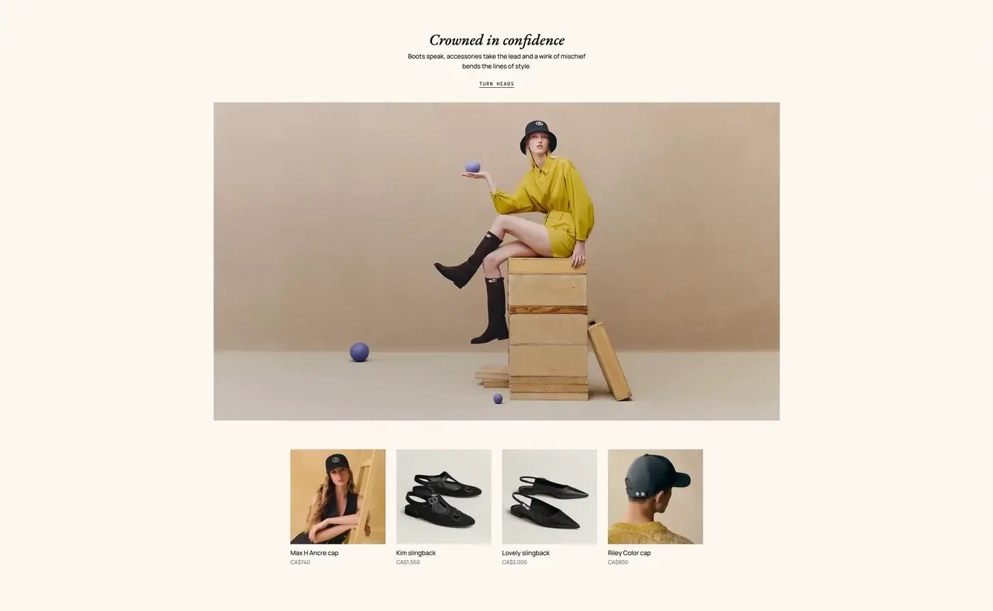
Luxury fashion houses like Hermès and Bottega Veneta use extreme white space strategically. The emptiness signals confidence and exclusivity. There’s no need to shout.
Fewer elements. More focus. Reduced cognitive load.
The silence communicates value.
Stripe & Figma: Making Complexity Feel Simple
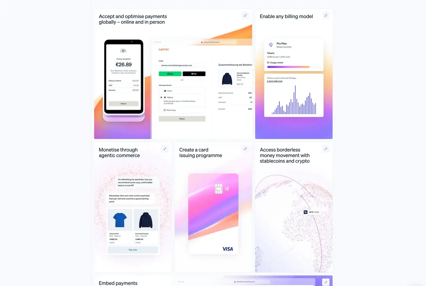
Software companies like Stripe and Figma handle complex products. Yet their websites feel approachable.
Clear structure reduces cognitive load. Smooth animations reinforce innovation. The overall experience creates a halo of intelligence and reliability.
They don’t just explain their product — they make you feel capable of using it.
A Practical Framework for Building a Premium Website
If you want your website to command trust immediately, apply this three-step approach.
1. Engineer the First Impression
- Focus obsessively on the hero section.
- Decide the primary emotional outcome.
- Remove distractions.
- Invest in typography, spacing, and imagery.
Your homepage isn’t decoration. It’s positioning.
2. Eliminate Cognitive Friction
- Simplify navigation.
- Remove unnecessary content.
- Give every section a single purpose.
- Increase spacing and visual hierarchy.
If something doesn’t help users move forward, it’s noise.
3. Design Moments of Delight
- Add responsive hover states.
- Improve form feedback.
- Refine transitions.
- Make scrolling feel intentional.
Micro-interactions aren’t extras. They communicate craftsmanship.
Premium Website Design Is About Respect
High-end web experiences aren’t built on manipulation or gimmicks. They’re built on respect:
- Respect for the user’s time through clarity
- Respect for their attention through thoughtful structure
- Respect for their emotional response through refined detail
When a website feels premium, it’s because someone intentionally designed it to feel that way.
At An Infinite Number of Monkeys, we approach web design and development as a psychological experience—not just a visual one. Because when your digital presence signals authority in the first moments, everything that follows becomes easier: engagement, trust, and conversion.
If your website isn’t creating that immediate sense of quality, it’s not a branding issue. It’s a design psychology issue. And that’s solvable.
